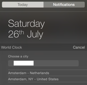
I have just installed OS X Yosemite Beta today and had already submitted three issues. I am really excited about it.
Issue/Improvement # 1: Feedback Assistant UI
- What I miss the most is a way to attach images. Many issues are far easier to explain with screen shots.
- What I also miss is more dimensions to categorise an issue than just “select the application”. Surely, the current Feedback Assistant UI has provided quite a primitive way to categorise your findings, however, some issues are multi-dimensional: application, minor vs. major, bug vs. improvement, technical vs. usability, to name a few. The issue tracking system I’m using in my work allows so much more means to classify an issue which enables it to be dealt with by the right team in time with very little manual work. And I’m talking about hundreds of issues in our case. With millions of Beta testers, Apple is going to be bombarded with issues. Definitely more means to categorise a finding is needed. I ended up with including keywords in the title. (but that needs manual work)
Issue # 2: Safari sometimes snaps to mobile version
When you browse with the new Safari, some website will snap automatically to the mobile version. However, when use Chrome, the same websites stick to the web version. I am not sure it’s more a problem of the websites or Safari. Not every websites that have mobile version do that. But still, some users are going to blame the browser.
Issue # 3: Highlight and the contents that are highlighted are in the same colour
Even though I’m trying my best to describe the issue, it’s going to sounds a mouthful. This is a perfect example of an image says it all. Just take a look at the following image:
See, the image pretty much explains everything.
